

The Rebranding of Brandzcafe
From Roots to Wings
For Brandzcafe, a business dedicated to empowering cafes and baristas, refreshing their brand image was essential to continue inspiring and educating their audience. This case study explores the journey of rebranding Brandzcafe, from honoring their heritage to embracing innovation, and showcases the transformation of their visual identity.
Background
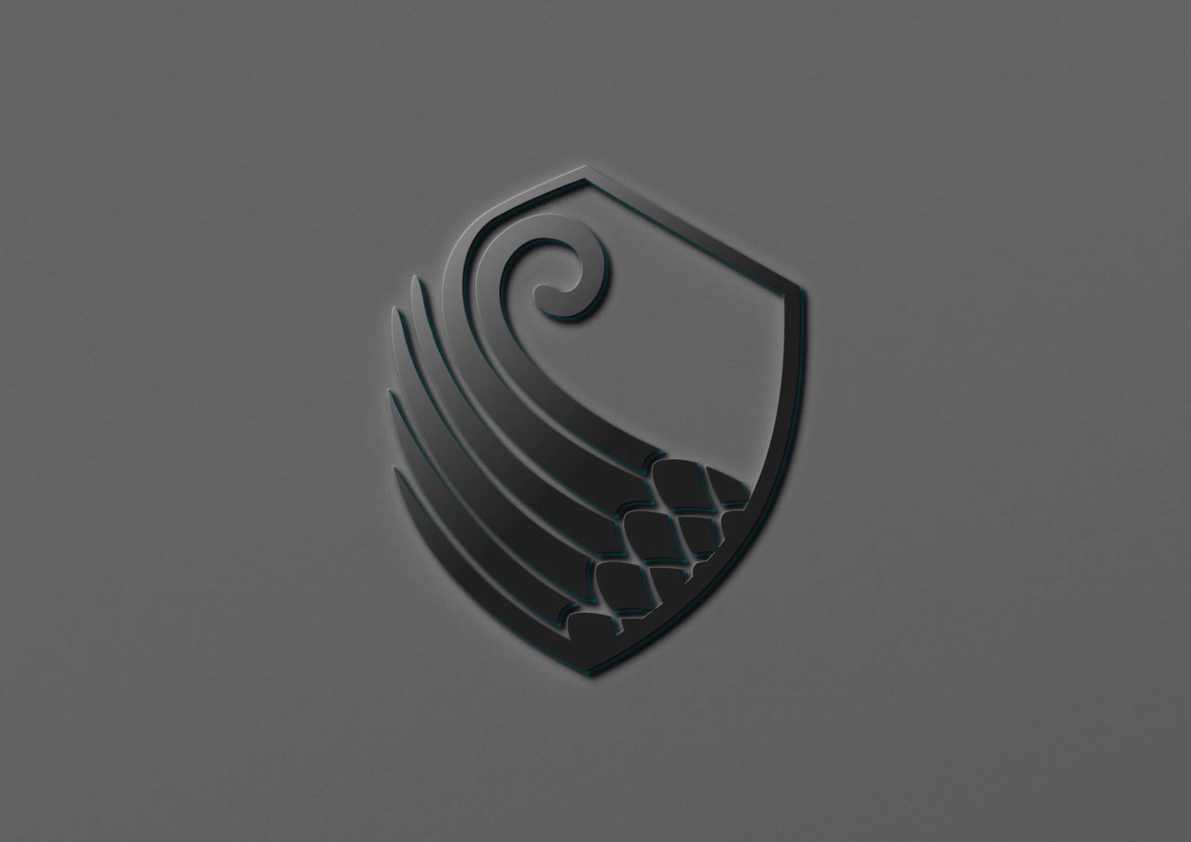
Brandzcafe is a Bartender and Barista Academy that aims to craft exquisite beverages and enlighten individuals through education. The brand’s logo, a harmonious fusion of a wing and a shield, draws inspiration from the ancient Sassanid era, symbolizing strength, protection, and unbridled aspiration.
Challenges
The brand needed to refresh its image and create a unique visual identity that would stand out in the market. The challenge was to create a design that would honor the legacy of the past while propelling the brand into an exciting future.
Solution
The brand needed to refresh its image and create a unique visual identity that would stand out in the market. The challenge was to create a design that would honor the legacy of the past while propelling the brand into an exciting future.
Designing Assets
Unique shield-shaped asset, accompanied by a trail reminiscent of a wing
This captivating design element emerges from the contours of our logo, seamlessly blending the form of a wing with the strength of a shield. The repeated shield motif creates a trail akin to a wing, and when overlaid on an image, it conjures an enchanting effect—softening the surroundings and infusing them with our brand’s signature color filter. The shield symbolizes our protective nature, while the wing trail embodies our unbounded ambition. Together, they encapsulate our unwavering commitment to safeguarding and propelling our audience toward extraordinary experiences. With this mesmerizing fusion, we extend an invitation to envision a world of limitless possibilities, cradled within the secure embrace of our brand.


A glance into transformation
Before and After
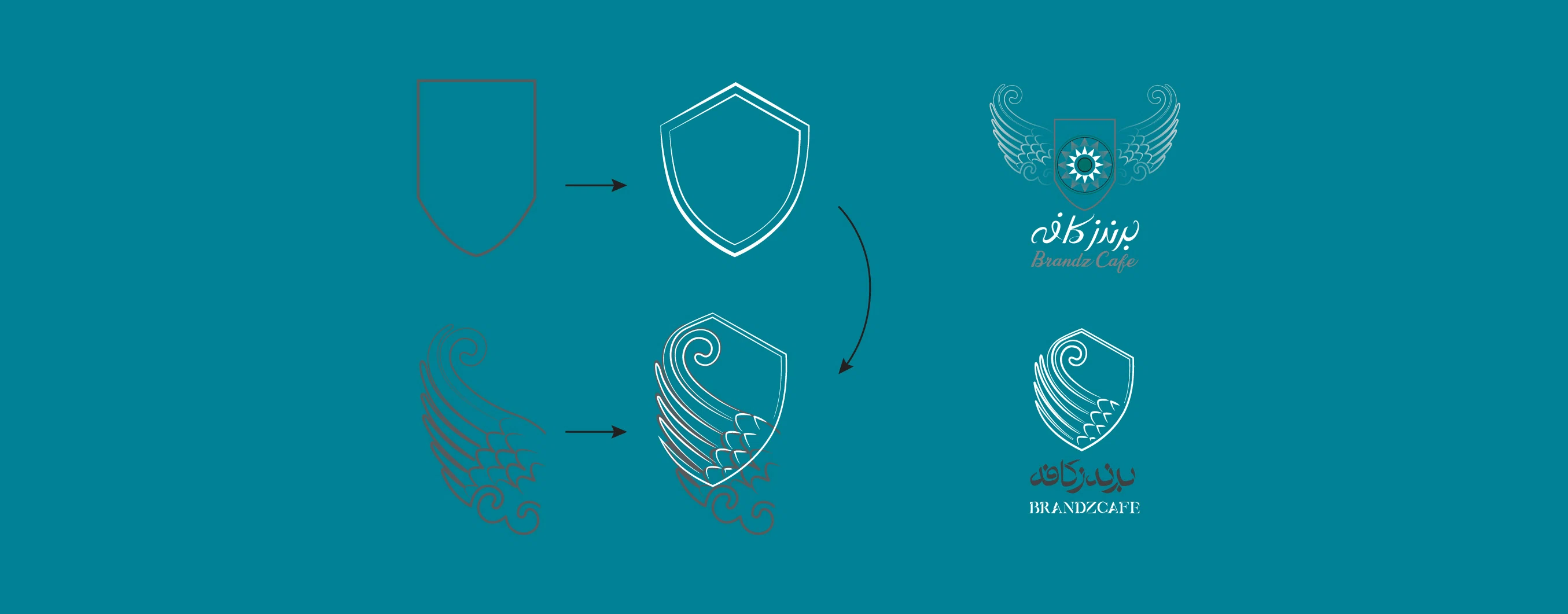
With unwavering determination, we’ve reenvisioned a key element of our logo—the shield. By substituting the wing with a fresh, inspired addition, we’ve birthed a logo that harmonizes with our current and future pursuits.
Our new emblem stands tall as a potent symbol of advancement, renewal, and the boundless horizons awaiting us.